Dataset summary, stations filtering and selection
This section explains how to interact with the dataset display page to analyse the dataset content and to filter and select the input stations for an experiment. The functions available are exactly the same both for assessment and forecasting experiments.
Stations are displayed on a table and on a map and the two views are always linked.
Summary panel

Fig. 29 Summary panel showing stations type and area info
The top-right section of the “Dataset Summary” page displays information about the loaded dataset’s content, including its storage size and the total, filtered, and selected number of stations.
Note
The “Dataset Summary” page allows you to browse the dataset and decide which stations to include in your experiments. You can do this using two distinct subsetting mechanisms: stations can be filtered using their alphanumeric attributes (the columns displayed in the stations table), and/or they can be (yellow) selected by clicking on rows in the stations table or on station points on the map. These operations are described in more detail in the Stations table and Stations map sections. The window for configuring experiment parameters clearly displays the current number of filtered and (yellow) selected stations, allowing you to choose which subset to use as the input for your experiment (see the Run an experiment page for reference).
The summary panel also shows the date and time the dataset was loaded and last modified (for example, when an experiment is executed or removed). The two animated pie charts below are linked to the stations table and the stations map; they graphically visualize the distribution of stations by Type (background, industrial, traffic) and by Area (urban, suburban, rural).
Finally, the bottom part of the summary panel displays the number of stations for each pollutant defined in the dataset’s startup.ini file. Like the pie charts, this section is dynamically updated by the filtering mechanism.
Stations toolbar

Fig. 30 Toolbar containing functions to interact with the list of stations
The function of the stations toolbar are:
Icon
Function

Reset all stations filters based on table columns

Reset stations (yellow) selection

Display timeseries of the (yellow) selected stations

Download the curret dataset as a .zip archive
The button to display the timeseries is active only when a “yellow selection” is active (meaning one or more stations have been selected by clicking on the stations table or map). When clicked, it opens an overlay window that displays the full timeseries of both observed and modeled data for all currently selected stations.

Fig. 31 Display of observed and modeled values for two stations (assessment tool)
When the same function is activated on the forecasting tool, the timeseries window allows also for the selection of the forecasting horizon (0, 1, 2 can be multi-selected and displayed on the chart):
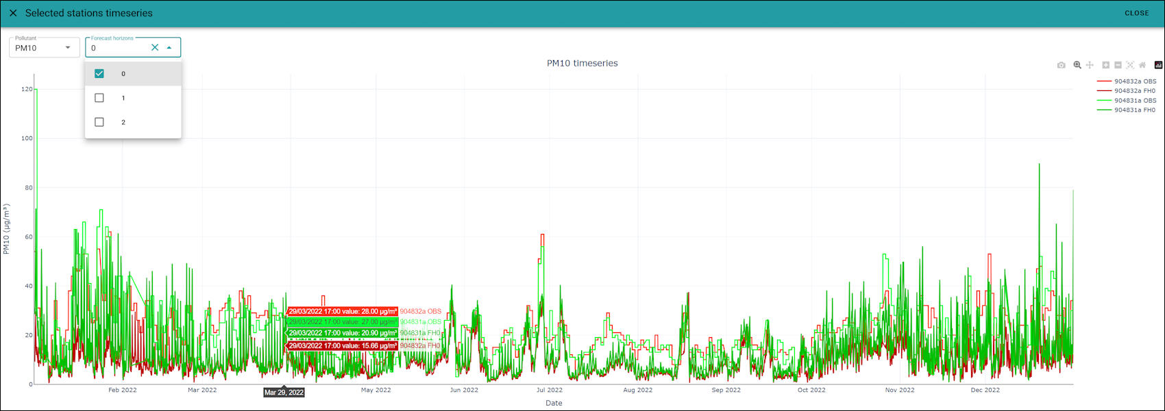
Fig. 32 Display of observed and modeled values for two stations (forecasting tool)
In both cases, each station is assigned a unique color; the observed data is shown in this color, while the corresponding model datasets are displayed in darker shades of the same color. Hovering the cursor over the chart displays the specific observed and modeled values for that date and time.
Clicking or double-clicking items in the chart legend (located at the top right) allows you to hide or show individual data series. This is a standard feature of Plotly charts (for details, see the Plotly legends documentation).
Stations table
The following figure displays a table containing the stations with their associated attribute columns:

Fig. 33 Stations table
Stations filtering
Each column in the table features a filter icon to the right of its name. Clicking this icon allows you to filter stations by selecting individual column values or defining specific numeric ranges. For example, you can easily filter the dataset to display only a specific station type (such as background stations), stations measuring a specific pollutant, or stations above a certain altitude threshold.
The figure below illustrates how to create a filter by station type, which is useful when preparing an experiment that requires only background stations as input:

Fig. 34 Filter the stations to keep only those in background areas
The filtering mechanism temporarily hides stations that do not satisfy the active criteria. Clicking the “Reset all stations filters based on table columns” button in the Stations toolbar toolbar clears all filters and restores the full dataset display.
Note
Please note that when multiple filters are applied simultaneously, they are combined using a logical AND operation. This means only stations that satisfy all active filters will remain visible in the table.
In addition to the standard 13 columns defined in the startup.ini format - note that the optional 13th column can specify a fixed/indicative flag at the station level, as described in the startup.ini chapter of the fmm_assess documentation — the system performs a spatial join during dataset loading. This joins station locations with European NUTS administrative levels (NUTS0 = country, NUTS1 = macroregion, NUTS2 = region, and NUTS3 = province). Scrolling to the right of the stations table reveals the NUTS regions to which each station belongs. This spatial join enables you to easily filter stations within a specific administrative boundary to run experiments on localized geographic areas.
Stations (yellow) selection
The (yellow) selection is a separate, distinct mechanism for subsetting stations. It can be used either to isolate data for the timeseries display (as detailed in the Stations toolbar section) or as an alternative method for choosing input stations for a new experiment (see the Run an experiment page for details on toggling between filtered or selected stations).
You can (yellow) select a station by clicking its row in the Stations Table. Holding the Shift or Ctrl keys enables multi-row selection. This selection mechanism is also fully integrated with the Stations Map, as described in the next section.

Fig. 35 Yellow selection on the stations table
Stations map
The visualization of station positions on the map is dynamically linked to the Stations table. Any filtering or (yellow) selection applied in the table is immediately reflected on the map, and vice versa. You can change the background map by clicking the buttons on the lower-right side of the map to select from the “Gisco”, “Esri”, or “Google” basemaps.

Fig. 36 Stations map
In the lower-left corner of the map, you can toggle between two legends to change how stations are represented:
Display stations colored by station_type:

Display stations colored by station_area:

To select multiple stations directly on the map, simply hold down the Ctrl key on your keyboard while clicking on the stations.

Fig. 37 Yellow selection on the stations map