Forecasting
FAIRMODE DeltaTool-forecast is a Python implementation of the FAIRMODE DeltaTool forecast-evaluation workflow, used to assess the quality of air-quality forecasts against monitoring observations. It computes the FAIRMODE forecast indicators — the forecast Modelling Quality Indicator (MQIf) and the Modelling Performance Indicators (MPI1, MPI2), together with the underlying statistics (BIAS, RMSE, CRMSE) and threshold-exceedance skill scores (SR, POD, FBIAS, TS, GSS) — on a per-station basis for NO2, O3, PM10 and PM2.5, and produces the corresponding Summary Report, Target Plot, MPI and threshold-performance diagrams.
Performance is benchmarked against a persistence forecast, so the indicators express whether a model adds skill beyond the persistent model. The tool is a porting of the Delta-Tool.
Users can upload a single dataset into the tool server storage. Once a dataset is loaded, they can run one or more experiments on the same dataset (for instance one experiment per pollutant, or more experiments on the same pollutant by changing the input parameters, etc.). When a new dataset is loaded, the old one is removed.
Important
Please keep in mind that your uploaded dataset will be automatically deleted after ten (10) days of inactivity. Delta Tool Online should not be considered as a long term storage system: keep you stations data safely stored in your local storage, upload them to the tool, run your experiments and download the results as tables and charts.
Load your forecast dataset
Delta Tool Online enables the users to upload their own datasets containing stations and air quality monitoring data. The accepted format is the Delta Tool Legacy format (startup.ini file and two CSV files for each station, one for the observations and one for the model).
The Delta Tool legacy format is described in detail in the Forecasting inputs section.
Warning
Although the underlying fmf_eval library supports both CSV and NetCDF format for stations data, currently only the CSV version of the format is supported by the Delta Tool Online.
Load the sample forecast dataset
The simplest way to start using the Delta Tool Online is to click the “Load sample dataset” button in the Dataset upload dialog-box (see screenshot on the following chapter). This function loads, inside the user storage space, a simple dataset consisting of around 50 stations covering all european countries. After the loading, a download of the dataset can be useful to better understand the correct input format for guiding the uploading of your own dataset. Please refer to the Stations toolbar section to see how to download your current dataset.
Load a forecast dataset from the Delta Tool legacy format
To upload a forecast dataset in the Delta Tool legacy format, the user must select, from its local machine, the startup.ini file and some .zip archives containing CSV file, one for each station. At least two .zip archives are mandatory: the first .zip file to select must contain the observation data, while the second must include the CSV files for the forecast horizon 0. Other two optional .zip archives can be selected, containing the CSV files for the forecast horizon 1 and 2 respectively.
Note
The .zip archives containing CSV files will be exploded in “flat” mode, meaning that all files are extracted in the same folder on the server storage. This means that the directory structure inside each of the .zip archives is not taken into consideration.

Fig. 17 Loading of a forecast dataset
After the loading
As soon as the input files are selected and transferred to the server storage, the Delta Tool Online application performs some consistency checks on the uploaded data, trying to detect possible errors and inconsistencies in the data.

Fig. 18 Consistency checks on the uploaded dataset
In case some inconsistencies are detected, they are shown to the user in a dedicated window, otherwise the loaded dataset display is activated at the end of the checks. Typical inconsistencies are:
syntax errors detected in the startup.ini file
errors in CSV naming (CSV files should be named ‘Station Code’.csv or ‘Station Name’.csv)
missing columns on CSV files (occurring when a pollutant is listed for a station in the startup.ini file, but the correspondant column is not present in the observations or in the model data)
presence of additional files in the observations or model archives, not linked to stations listed in the startup.ini file
If the loading is successfull, the dataset display mode is activated, as shown in the following figure:

Fig. 19 Display of the uploaded dataset
To start analysing the content of your dataset and to filter/select the input stations for your experiments, please see Dataset summary, stations filtering and selection chapter where all the available functions (which are common to the assessment and forecasting section of the tool) are listed and explained.
How to use the top bar toolbar
The buttons on the top bar, displayed in the following figure, enable the user to activate all the available functions.

Fig. 20 Buttons of the top bar
The buttons are grouped as follows:
Dataset functions
Icon
Function

Load a dataset

Remove your dataset
Experiment functions
Icon
Function

Create a new experiment

Remove current experiment

Remove all your experiments

Select the current experiment
Display functions
Icon
Function

Display summary info on the current dataset

Display numerical outputs of the current experiment

Display plot outputs of the current experiment

Display stations map of the current experiment

Compare current experiment with a second one

Select one of the available forecasting horizons
In some specific cases, at the right of the top bar, new buttons appear, for instance when the display of the charts is activated (to select the zoom level of the charts display among XS-ExtraSmall, S-Small, M-Medium, L-Large, XL-ExtraLarge), or when the compare function is activated (to select the experiment to compare to the current experiment).
Run a forecast experiment
The following figure shows the dialog-box that opens when the user cliks on the “Create new experiment” button on the top bar:
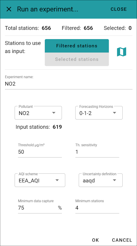
Fig. 21 Input parameters for running an experiment
The top of this window displays the current filtering and selection status of the stations. It allows you to choose which set of stations to use for the new experiment: either the filtered stations or the (yellow) selected stations. Directly to the right of this selection toggle, you can click the map icon to open a map view, allowing you to verify the exact list of stations included in the experiment.


Fig. 22 Map view of the input stations for the experiment
The Pollutant dropdown allows you to select the target pollutant. Whenever you change this selection, the label to the right updates to show the actual number of input stations (i.e., the effective number of filtered or selected stations that have valid data for the chosen pollutant).
The remaining widgets on the page allow you to configure the rest of the experiment’s input parameters:
Forecasting Horizons: selection among 0, 0-1 or 0-1-2 for the forecasting horizons to compute
Threshold: categorical exceedance threshold (µg/m³)
Th. sensitivity: threshold sensitivity ±1 µg/m³ for sensitivity plot
AQI scheme: one of EEA_AQI, UK4_AQI, UK10_AQI, USEPA_AQI
Uncertainty definition: aaqd or fairmode
Minimum data capture percentage
Minimum number of stations
Once you enter a name for the experiment, the OK button becomes active, allowing you to start the calculation. At this point the underlying fmf_eval Python library is called and in few minutes, depending on the number of input stations, the results will be produced.
In case the calculation generates errors, the full log is displayed in an overlapping window, otherwise the display of the numerical outputs of the experiment is activated.
Analyse experiment results
After a run terminates successfully, the system generates both numerical and graphical outputs, as detailed in the Output section, which lists all results produced by the fmf_eval library. To assist with analysis, the Delta Tool Online application provides several visualization and comparison tools, which are described in the following chapters.
Numerical results
By clicking the “Display numerical outputs of the current experiment” button in the Display section of the top bar (see Display functions):
the main numerical outputs of the currently selected experiment are displayed:

Fig. 23 Numerical results of an assessment experiment
The top section of this page summarizes the input parameters selected to start the experiment (reflecting all the choices made on the Run a forecast experiment window). Immediately to the right, three buttons allow for the download of the experiment result, respectively: download all the tabular outputs, download all the charts images, download both tabular and chart outputs:

Directly below the top of the screen, the main indicators are displayed using a graphical layout, with red and green color coding to represent the success or failure of their respective thresholds, together with a graphical representation of the share of stations with MQIf ≤ 1 and the share of stations with both MPI1 ≤ 1 and MPI2 ≤ 1.
Three tabular representations are present in the page. On the top-right side of the page, the log messages collected from the fmm_asses library execution are displayed, allowing for detailed check of the correct execution of the calculations (stations exclusions and other log messages will be presented in this table). In the top-center position, the categories per stations are listed, according to the AQI scheme selected in the Run a forecast experiment window. The lower part of the screen shows the full table of the indicators calculated for each of the input stations.
Charts outputs
By clicking the “Display plot outputs of the current experiment” button in the Display section of the top bar (see Display functions):
the chart outputs of the currently selected experiment are displayed:

Fig. 24 Graphical outputs of an assessment experiment
All charts are interactive; hovering the cursor over the chart content displays additional detailed information. You can also zoom in on or download the charts using the tools in the toolbar that appears at the top right of each chart.
Additionally, you can adjust the overall display size of the charts by selecting a zoom factor, XS (Extra Small), S (Small), M (Medium), L (Large), or XL (Extra Large), from the application’s top bar.
For a detailed description of each chart’s content, please refer to the Diagrams chapter in the fmf_eval documentation. For tips on how to interpret and analyse the graphical outputs, see the Plots reading guide.
Map output
By clicking the “Display stations map of the current experiment” button in the Display section of the top bar (see Display functions):
a map windows is opened that allows for geographical display of the stations, with colors defined by each of the calculated indicators and the symbol defined by the station type (a circle for the background stations, a square for the industrial stations and a triangle for the traffic stations):

Fig. 25 Map visualization of output indicators per station
On the lower-left side of the map, you can select which indicator to visualize. The corresponding color legend is displayed immediately below this selection. It is also possible to hide one or more station types by clicking on the corresponding checkboxe just below the legend. Clicking on any station on the map, displays its specific indicator value.
Note
For indicators with an acceptance threshold of 1.0 (such as MQIf, MPI1 and MPI2), the map uses a diverging color palette centered at 1.0 that transitions from green to red. For all other indicators, a Viridis palette is used, with color intervals scaled across the range from -2 to +2 standard deviations from the average ([average - 2*std.dev, average + 2*std.dev]).
Compare two experiments
When more than one experiment has been calculated, the “Compare current experiment with a second one” button becomes active on the application’s top bar.
Clicking this button reveals a selection menu on the right side of the top bar, allowing you to choose which experiment to compare against the currently active one. The main window then updates to let you select which specific output component of the two experiments to compare side by side.
The following components are available for comparison:
Input parameters: displays a side-by-side list of the parameters used to run each experiment
Main indicators: shows the primary numerical indicators for both experiments
Forecast Target Plot
Forecast Threshold Performance
Forecast MPI Plot
Forecast Threshold Normalized Performance
Forecast Summary Report
Forecast Summary P-Normalized Report
Forecast AQI
POD & SR sensitivity
Stations Map: displays the stations on two adjacent maps whose zoom and pan actions are synchronized
The figures below show examples of comparisons for the main indicators, the scatter plot, and the stations map, respectively:

Fig. 26 Comparison of the main indicators

Fig. 27 Comparison of the Forecast Summary P-Normalized Report

Fig. 28 Comparison of the stations map